Some thoughts about the early spring blub paintings -- or how I began to paint seriously again.9/21/2018
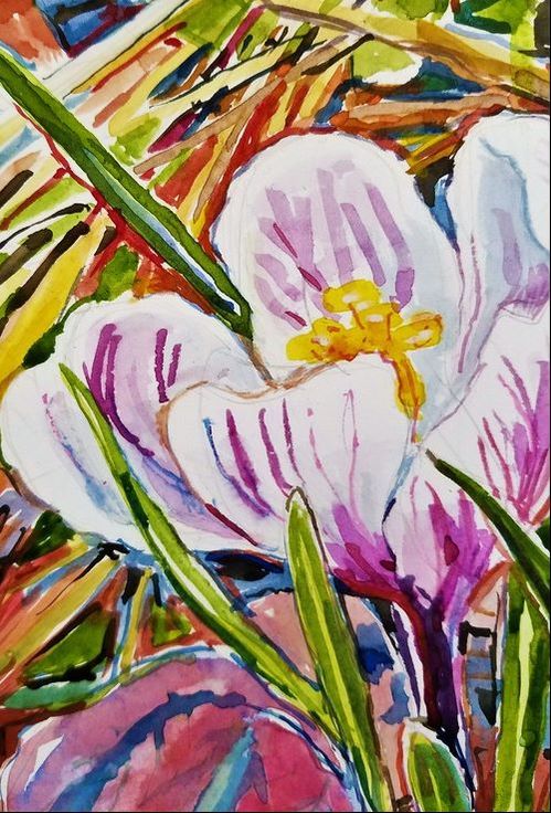
For the most part, in February and March, the yard and garden is barren. There is nothing much alive. However, when I look carefully, I find that, even in the darkest times of the year, life is emerging. And that was exactly what I needed to find. In order to see the small snow drops, tiny early irises, and crocus, I needed to look beyond the clutter of debris. This is a central idea of the imagery – looking selectively to see beauty and wonder in a confusing, often bleak and alienating world. I started by simply taking cell phone pictures of the early bulbs simply because I liked them. I noticed the undulating forms revealed the fascinating slow dance of these bulbs’ growth. These complex and slightly cantilevered shapes interacting with the brown leaves and twigs on the ground clearly implied the struggles of growing in a forbidding environment – yet these plants also exhibited colorful and extravagant blooms – they were thriving. I found images that held that history of struggle contrasting with the delicate ethereal flowers – this is the motif – this was our shared experience of early winter. To make the paintings - I would print the photo – cropped to proportion of the rectangle that I liked and then size the watercolor paper in the same rectangle but larger. Often I would put midlines on the photos as well as the paper to make sure I could make the shapes as accurate as possible I spent a long time getting the drawing down because I really wanted to make sure that the interactions between the plants were both true to what I observed and also captured the distinctive gestures of each blub reaching out of the cold ground stretching towards the sun and either budding or blooming. I had to be very careful about the drawing since there are few corrections possible in transparent watercolor. I am not sure why I started in such a merciless media except, working in my living room studio at the dining table inherited from my mom, it seemed easier and less messy than getting out the oil paints. (Of course, I did get them out later.) In a way watercolor narrows your options – and this is probably what I wanted – it felt confining in a good way. When I begin to put down the color, I do as I usually do – and as I teach others to do – I work light to dark. I make sure I preserve the whites by keeping the paper itself untouched. I chose color that is both accurate to nature as well as evocative of a light and mood from the beginning. I try, in all media, to make every mark look like I mean it to be seen as it. I don’t use washes or background colors that I intend to paint over. I want the image to be always direct and immediate. This also means I paint all areas of the image at the same time. This allows the images to grow as a whole organically. I seek to weave the marks together in much the same way the image is revealed to the viewer by one shape overlapping the other. It is the relationship of one shape to another that defines the forms and the space. Again, one of the ideas I have worked with in all my paintings is how object show themselves – nothing exists in isolation – we only see one thing in how it contrasts to something else. I think this is an important realization as to how we perceive the world. Once the main shapes are established it becomes easier and almost automatic; I fill spaces with the patterns, in this case the patterns of the intersecting plant fragment that litter the ground. This is a fun part because I begin to see living forms; moving, grasping life forms emerge from a chaotic and lifeless pattern …. It is at this point as well that I try to push the colors –creating form and shadows with compliments. Here I take a lesson from Bonnard and Villard – using bright colors for both shadows and neutrals. The contrasting shadows create the edges of the form and lift them in space. And used correctly they read as neutrals yet make the image shine. I try to use few earth tones with the exception of a little burnt sienna – it has a lovely transparency - and burnt umber if I really want something to sink into a dark. I rarely use black or even Payne’s grey. Yet making these paintings took a lot of effort. I know what I’m doing – I’ve been competent for a long time – I know I can render the image – however, making these paintings was a struggle. I’d find myself getting up from the work many, many times – worried I’d mess it up. It was not technically difficult – not an issue of hand skills or choosing the right color, but more one of faith – giving myself permission to believe in myself and to be free of worry. For instance, about a third of the way in the image starts to look pretty good. This can be a difficult stage, because you can’t go back to it again; you can’t go back to this point that is full of promise – one has to move on. And just trust you can make good on that potential. So I did, and mostly I’d surprise myself that I did not, in fact, screw up. And as the spring began to develop I expanded the scale and the ambition. Like the bulbs in my garden and the perennial flowers that followed - I came back. 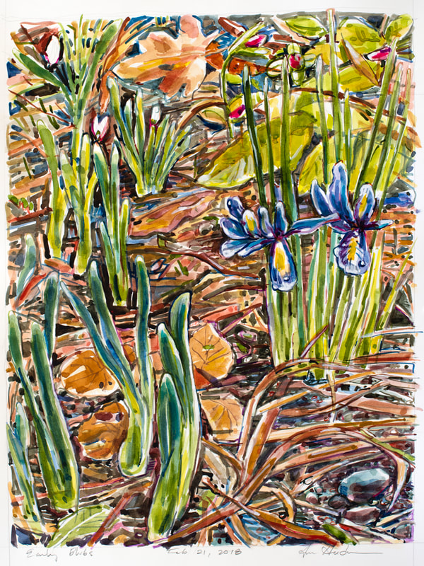 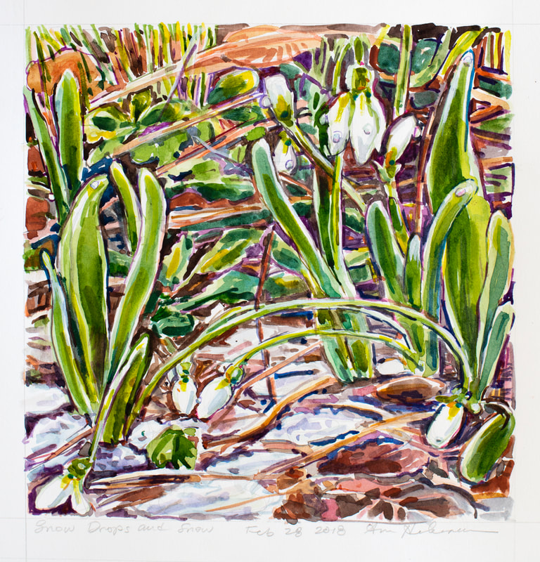 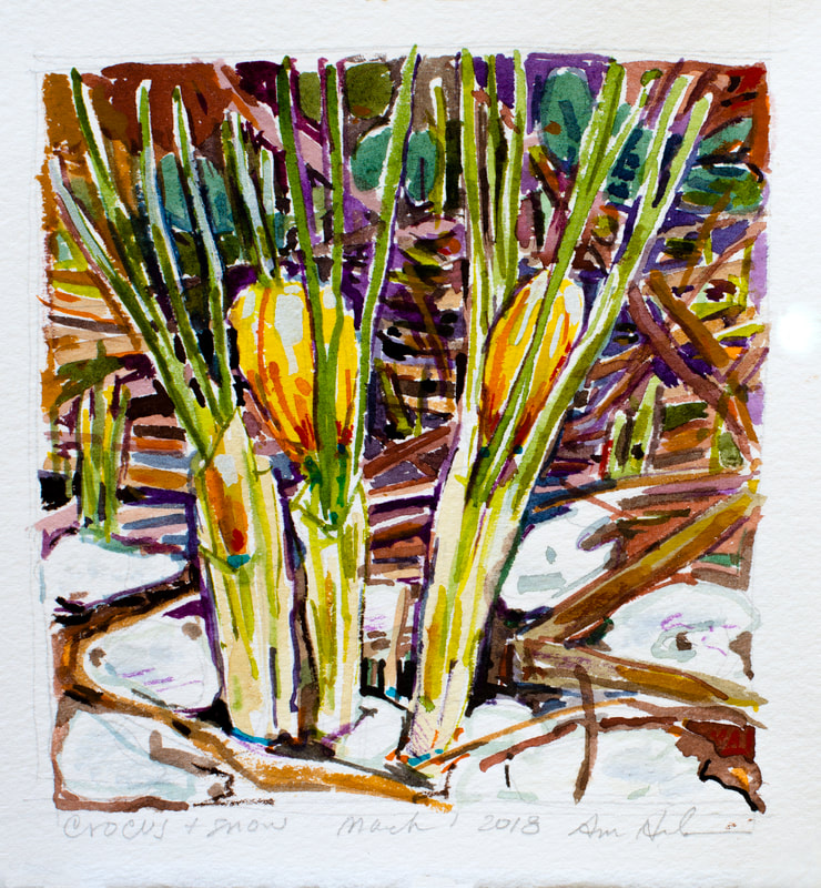  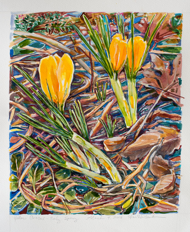 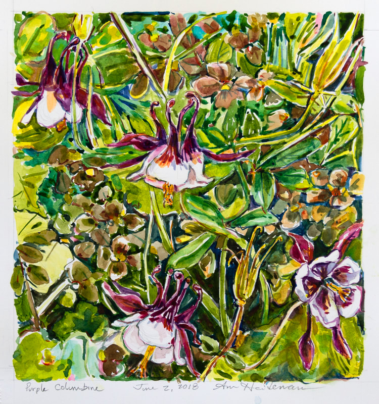 The paintings are in sequential order. There are a few others that are not photographed. Between the crocus and columbine painting I was working on some oil paintings. For descriptions of the paintings or to shop click the buttons below.
0 Comments
|